Hello Forum,
I’ve some suggestions for site improvement and the addition of tags.
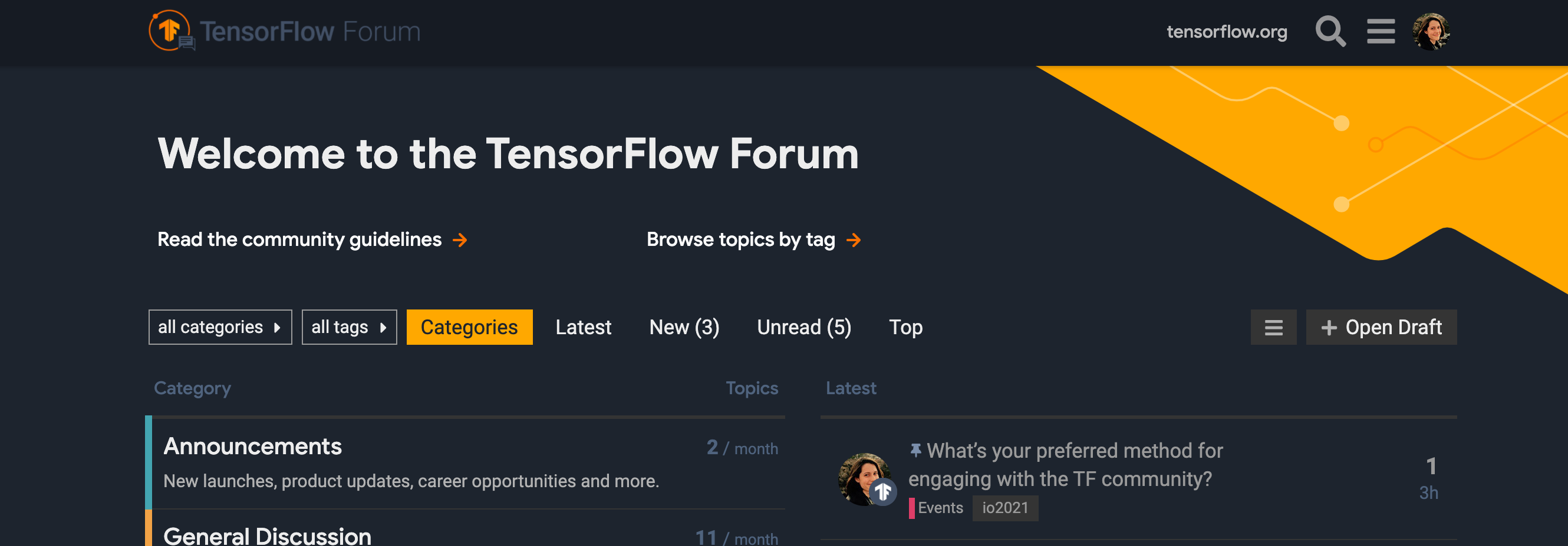
Site Improvement
The site will look better if the colour will be changed to black. This colour of bluish-grey doesn’t look appealing, especially on AMOLED screens. Change of colour with a combination of black-orange will make the site look more good.
The Latest section goes down too long on the page when many topics get added. There should be a drop-down button that will load the further topics in the latest section or divert to another page, which will be specially meant for the latest section.
Addition of emojis to the tags (of category), just like GitHub’s discussion will look more appealing.
Tag Request
There should be a tag for Courses available online made by GDEs or experts where beginners/learners can come and discuss the basic level Tensorflow problems and doubts.
These are some suggestions from my side.
Thanking You.
Hi there, I’m not sure what you mean? Font, background, or something else? You can toggle your default display mode in the user menu Preferences>Interface.
That is the current Discourse default. I’m not sure if we can modify that on our end, but will look into the issue you’re describing.
Do you mean making emoji’s available for post reactions? Or to category/tag titles?
You can toggle background color in your user preferences. That being said, my background is black. I am seeing that the font we’re using for some page elements does not stand out from the black adequately. cc @kristen
This may be available via a Discourse plugin, though I see the available one (Retort) may have some bugs. I’ll discuss with the team and see if that’s something we’d like to enable.
@thea@saswatsamal Thanks for the feedback! We opted against going with a pure black background, but we’ve updated the font colors for better contrast. Let me know your thoughts.