Hi,
I have built a VAE model with pytorch for dealing with tabular oceanographical data. My question is, what shall I do to visualize model weight and clarify the covariance relationship between input variables, as shown in the following chart, with tensorboard framework.
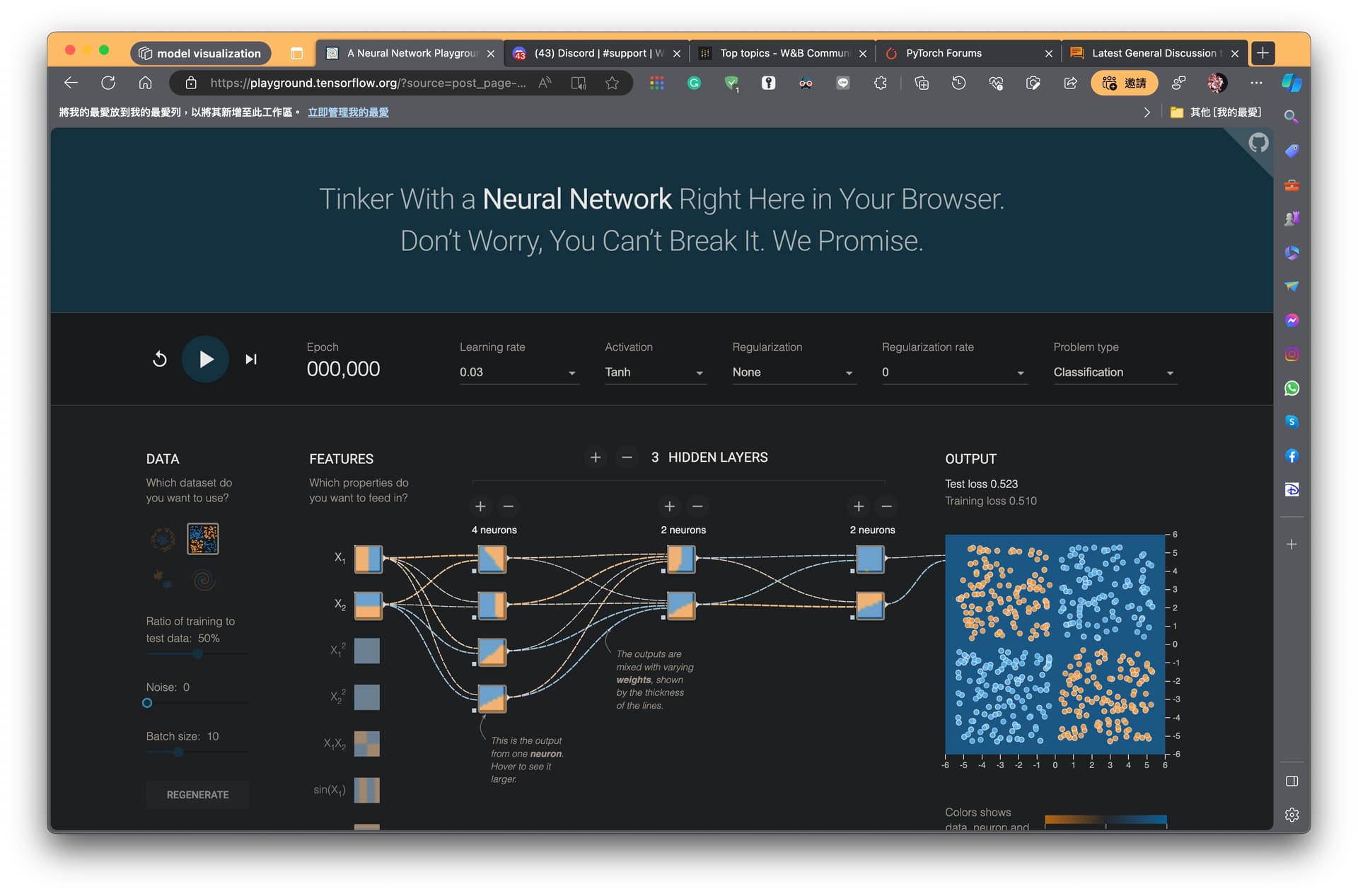
Here is the website of the screenshot.
Please note that I don’t need it to be dynamic; I only need to visualize the final model.
Sincerely,